Greyhound Mobile App Redesign
A comprehensive mobile app redesign for Greyhound bus services, improving the booking experience with an intuitive interface that improved checkout efficiency by 20% and enhanced the overall user experience.
Project Overview
Greyhound, America's iconic intercity bus service, faced challenges with their outdated mobile app that was causing frustration for users and resulting in lost bookings. The company needed a comprehensive redesign to improve the user experience, increase conversion rates, and modernize their digital presence.
I was tasked with completely reimagining the Greyhound mobile app experience, focusing on simplifying the booking process, improving navigation, and creating a visually appealing interface that aligned with Greyhound's brand identity while meeting modern design standards. (not affiliated with Greyhound)
Project
Greyhound Redesign
(not affiliated with Greyhound)
Date
Sep-Oct 2024
Scope of Work
User Research
Research Synthesis
Product Design
Tools Used
The Challenge
The Greyhound mobile app redesign presented several significant challenges:
Complex Booking Process
The existing app had a convoluted booking flow with too many steps, causing users to abandon their bookings before completion.
Outdated Interface
The app's visual design was outdated and inconsistent, creating a poor impression and lacking the modern features users expect from travel apps.
User Frustration
Customer feedback indicated high frustration with ticket management, trip tracking, and the overall user experience, leading to poor app store ratings.
Brand Implementation
Working within Greyhound's established brand guidelines, I created a refreshed visual identity for the mobile app that maintained brand recognition while introducing a more modern, user-friendly aesthetic.
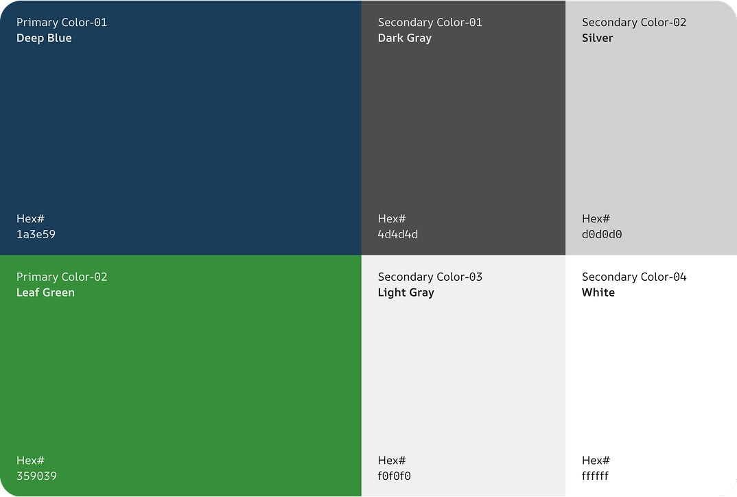
The color palette maintains Greyhound's iconic blue while introducing complementary colors for a more modern, accessible interface.
Typography
I selected IBM Plex Sans as the single typeface for the entire application. This clean, highly legible sans-serif font works well across different screen sizes and maintains readability in various contexts, from booking forms to ticket information.
FONT FAMILY
IBM Plex Sans
Used throughout the application for all text elements
Design System
I created a comprehensive design system with reusable components that ensured consistency across the app while allowing for flexibility in different contexts. This system included buttons, form elements, cards, and navigation components.
Key Components
- Standardized button styles with clear states
- Consistent form inputs optimized for mobile
- Card components for tickets and trip information
- Accessible color system with proper contrast
Design Process
I followed a comprehensive user-centered design process to ensure the redesigned app would meet both user needs and business objectives.
Research & Discovery
I began with extensive research, including analyzing app store reviews, conducting user interviews with frequent Greyhound travelers, and performing a competitive analysis of other transportation apps to identify best practices and opportunities.
User Journey Mapping
I created detailed user journey maps to understand the complete experience of booking and managing a Greyhound trip, identifying pain points and opportunities for improvement at each stage.
Information Architecture
I restructured the app's information architecture to create a more intuitive navigation system, reducing the number of steps required to complete key tasks like booking a trip or managing tickets.
Wireframing & Prototyping
I developed low and high-fidelity wireframes for key screens, focusing on simplifying the booking process and improving ticket management. These wireframes were then turned into interactive prototypes for testing.
Usability Testing
I conducted multiple rounds of usability testing with diverse participants to validate design decisions and identify areas for improvement, iterating on the designs based on user feedback.
Visual Design & Refinement
I applied Greyhound's brand guidelines to create a visually appealing interface that balanced brand recognition with modern design principles, ensuring accessibility and usability throughout.
UI/UX Design
The redesigned Greyhound app features a clean, intuitive interface that simplifies the booking process and improves the overall user experience.
Key Features
The redesigned app includes several key features that significantly improve the user experience:
- ✓
Streamlined booking process reduced from 7 to 4 steps
- ✓
Intuitive trip management with digital tickets and real-time updates
- ✓
Interactive route map with station information and amenities
- ✓
Personalized user profiles with saved trips and payment methods
- ✓
Accessibility features including screen reader support and high contrast mode
Results
The final design for Greyhound includes a comprehensive set of screens that create a seamless user experience for booking and managing bus trips.
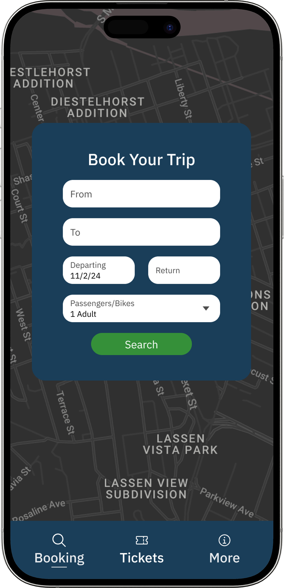
Simplified Booking
Streamlined booking process with an intuitive form and map-based interface that makes finding routes easy and efficient.
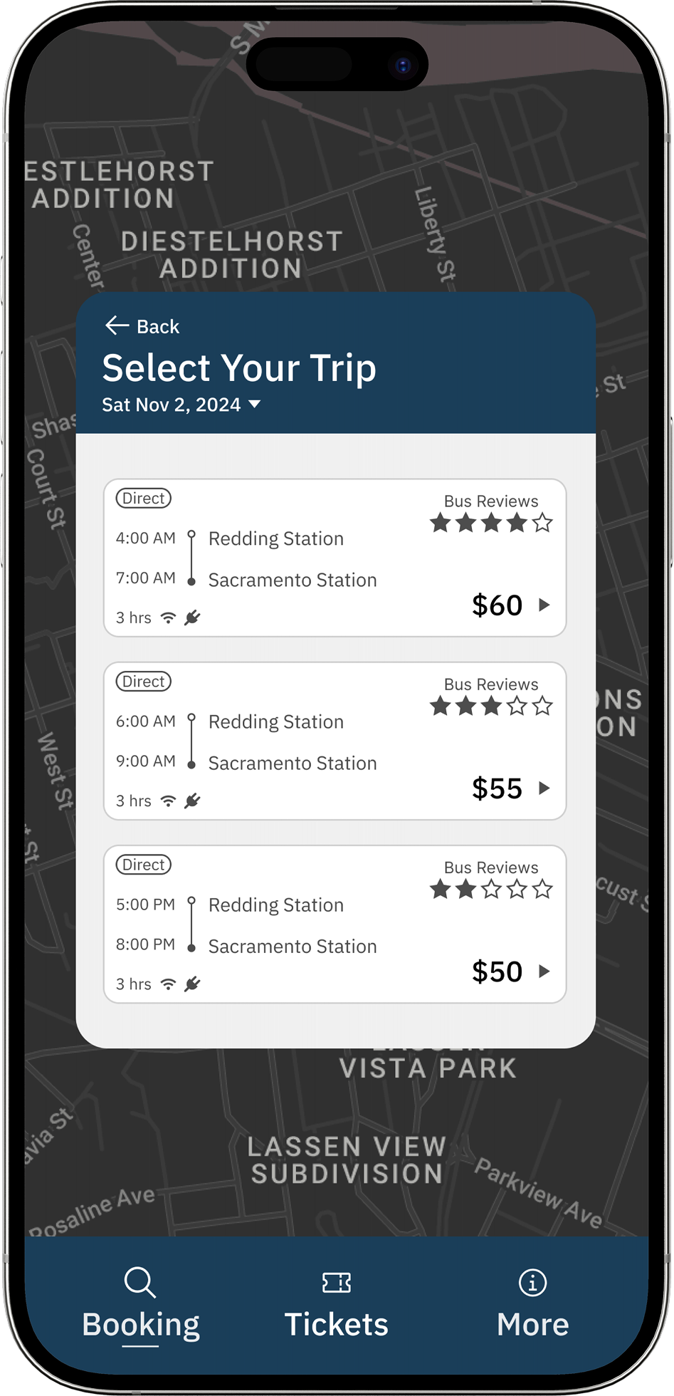
Clear Search Results
Organized trip options with transparent pricing, departure/arrival times, and bus quality ratings to help users make informed decisions.
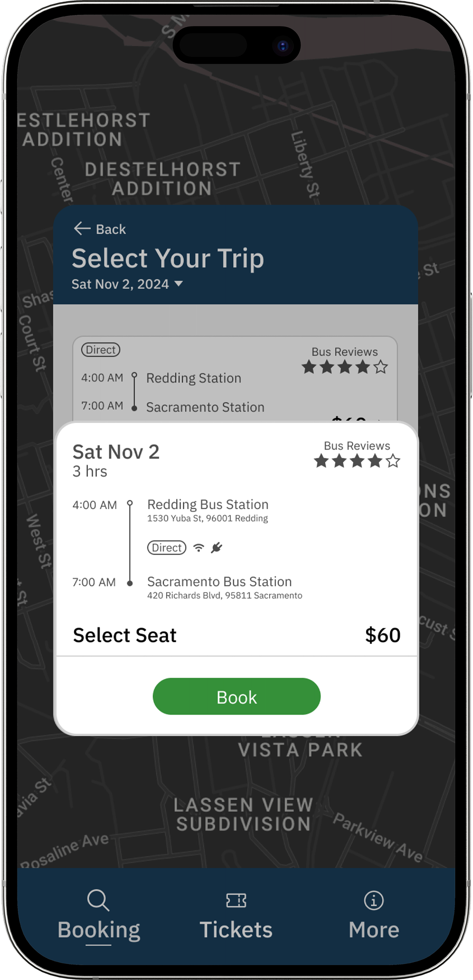
Detailed Trip View
Comprehensive trip information including station addresses and amenities, with a prominent call-to-action for seamless booking.
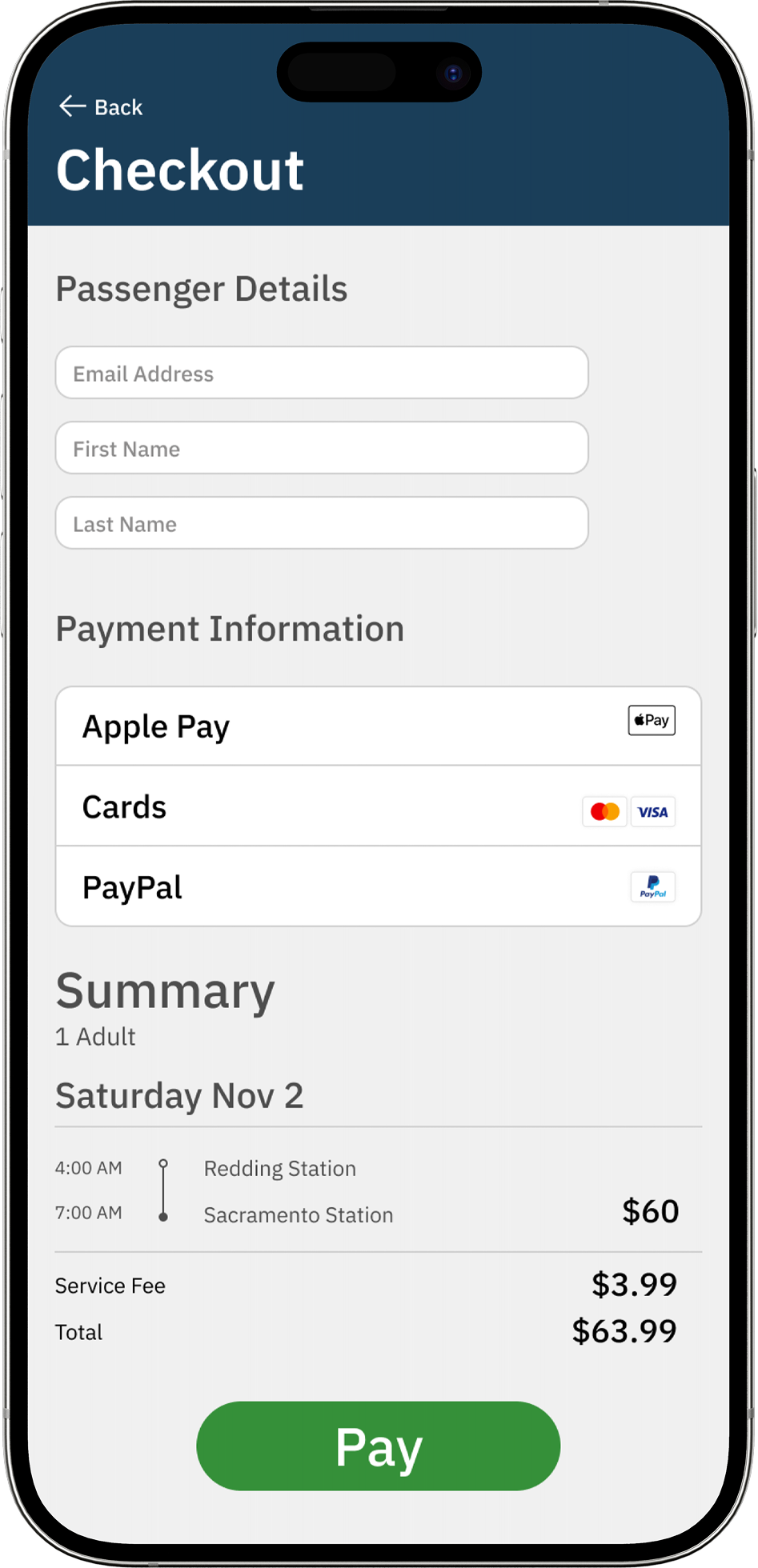
Streamlined Checkout
Simplified payment process with multiple payment options and a clear order summary to reduce abandonment and increase conversions.
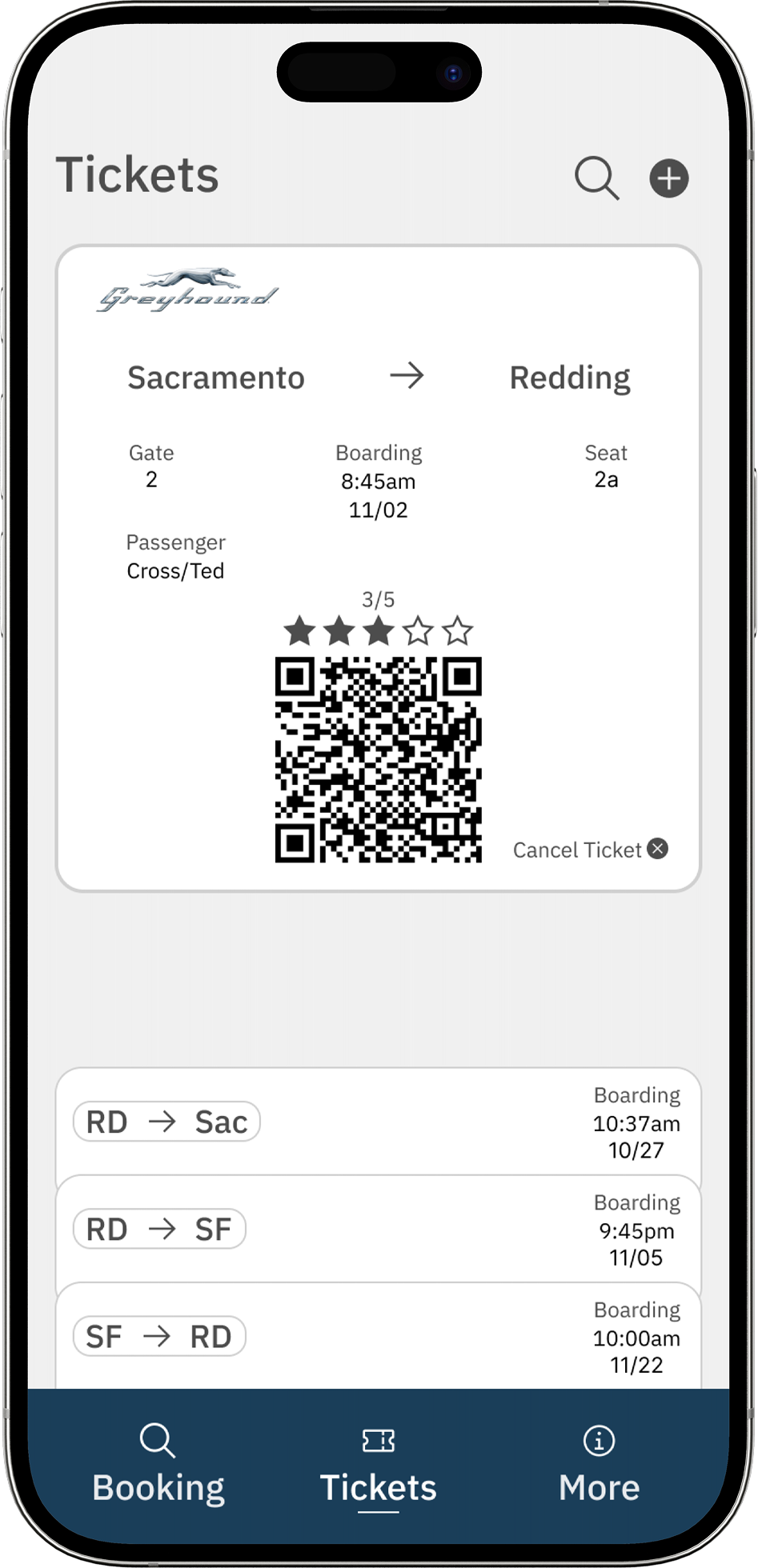
Digital Tickets
Mobile-friendly digital tickets with QR codes for easy boarding and a convenient overview of past and upcoming trips.
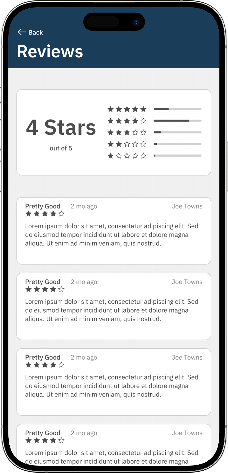
User Reviews
Transparent rating system that builds trust and helps users make informed decisions based on other travelers' experiences.
INTERACTIVE PROTOTYPE
Experience the redesigned Greyhound app firsthand with this interactive prototype. Click through the screens to see how users would book tickets, manage trips, and track buses.
Loading prototype...
Pro tip: Click through the prototype to explore the full user journey. Use the navigation buttons to move between screens.
Next Case Study
Explore more of my work and see how I help clients achieve their business goals through thoughtful design.
Finders Keepers Development
A complete mobile app development project that brings light to garage sales that go unnoticed everyday. The first high-quality app in this niche, creating an intuitive platform for treasure hunters and sellers.
View Case StudyLET'S CREATE SOMETHING AMAZING TOGETHER
Ready to elevate your digital presence? Contact me to discuss your project and how I can help you achieve your goals.
Get in Touch
I'd love to hear about your project. Fill out the form below and I'll get back to you as soon as possible.